Personal finance tool
WealthLens
A goal planner is a compounding calculator wearing a UI, and the honest version of that UI has to admit what the calculator doesn't know.
- Next.js 16·React 19·Zustand·Chart.js·Tailwind v4


One question, five instruments
Every personal-finance app in India answers the same question: I want ₹1 crore in fifteen years — what do I put away each month? The answer is one formula. The product is everything around the formula: which assumptions the user is allowed to touch, which are hidden, and how honestly the output admits it's a projection rather than a promise.
WealthLens is my version of that product, built as a craft piece on entirely synthetic data. Four routes: a returns calculator across five asset classes, a compare view that puts them on equal ground, a goal planner, and a portfolio view. No backend, no account, and no network calls at all. Everything computes in the browser from what you typed.
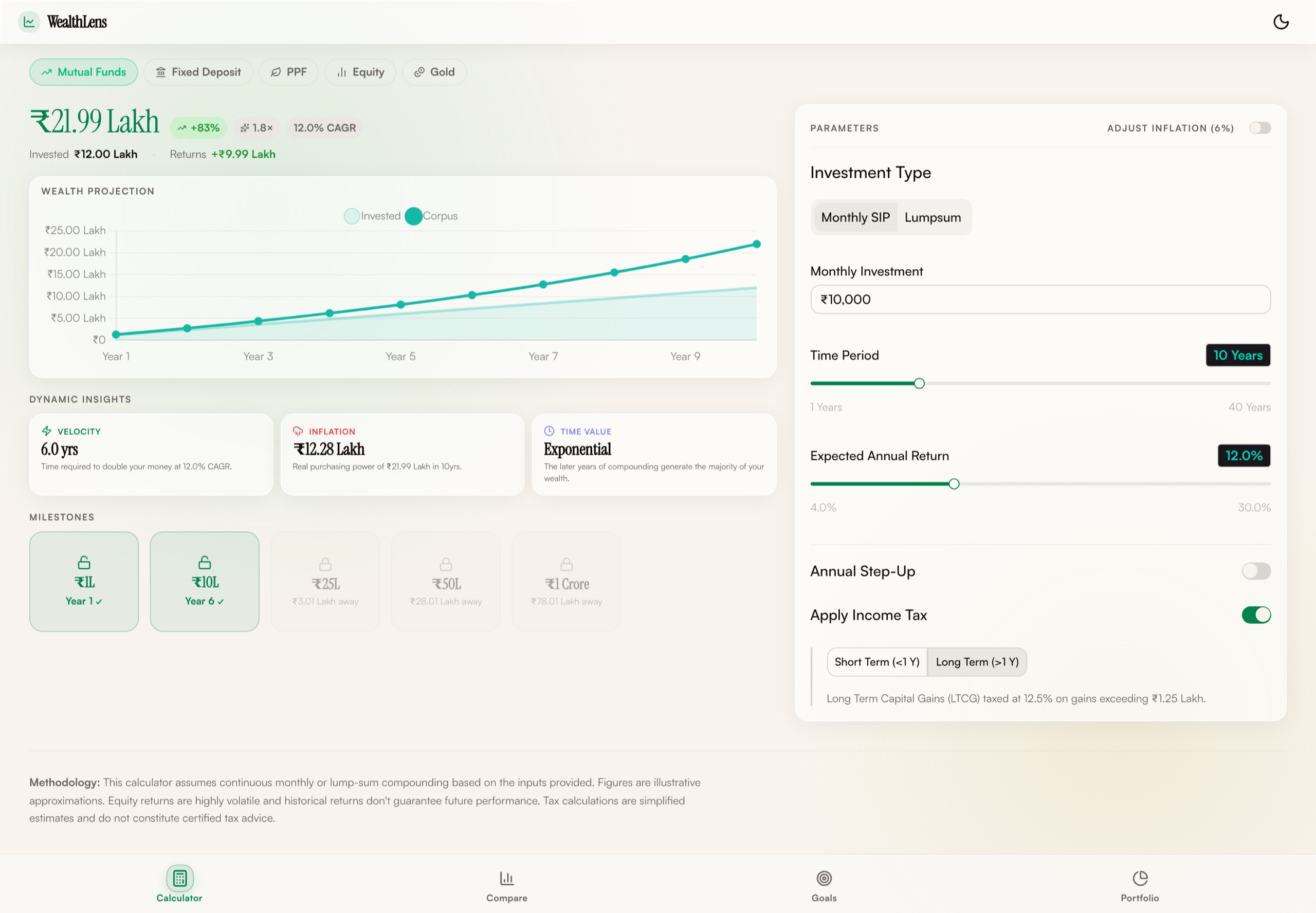
Figure 1. The returns calculator — route one of four. Every number on it is computed in the browser from the panel on the right; nothing is fetched, and there is nothing to fetch.
A capture of the app running locally. WealthLens has no backend and no seed data — the figures are whatever the inputs produce, which is why this screen can be published as-is.
- 4,048
- lines of TypeScript and CSS
- 4
- routes, all client-computed
- 0
- network calls — no API, no analytics, no persistence
- 5
- asset classes on one comparison footing
Figure 2. The whole architecture, which is the point. Nothing crosses the tab boundary: no request, no account, no stored assumption. The empty node on the right is not an omission — a tool whose entire job is arithmetic over numbers you typed has nothing to send anywhere, and saying so is cheaper than a privacy policy.
The formula, and the two numbers around it
The goal planner inverts the standard SIP future-value identity: given the target, the rate and the horizon, solve for the monthly payment. Contributions are treated as an annuity due (paid at the start of each month, so each one compounds one extra period), and the target is grossed up by compound inflation before the inversion, because ₹1 crore in fifteen years is not ₹1 crore.
That inversion produces one number, and one number is not a decision aid. The two framings next to it are what make the page useful: what inflation alone adds to the monthly figure, and what waiting two years costs. The second one is the formula run again at years − 2 and differenced: trivial arithmetic, and the most persuasive number on the screen, because it converts an abstraction about compounding into a monthly rupee amount you either pay now or pay later.
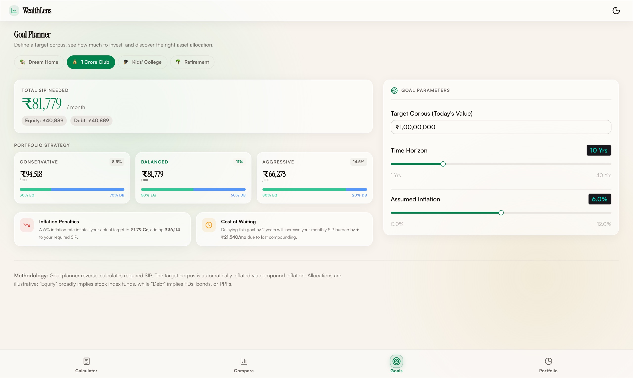
Figure 3. The goal planner as it actually ships: one inverted formula, three strategies, and the two framings — inflation penalty, cost of waiting — carrying the argument. Read the ₹81,779 at the top as a single confident number, because that is exactly what the next figure is about.
A capture of the app running locally, at its own default inputs: ₹1 crore, ten years, 6% inflation, Balanced.
- ₹1.00 Cr then is ₹2.40 Cr in 15 years
- inflation adds ₹30,436/mo
- Starting two years later
- costs ₹9,246/mo more
The same ₹52,229 a month lands anywhere between ₹1.67 Cr and ₹3.54 Cr if returns run 4 points either side of the 11% assumption. The plan only works at the exact rate you assumed — which is the sentence the single line never says.
Figure 4. The goal planner, ported — with the volatility band the shipped app promised but never wired up. Toggle it and watch the honest chart replace the confident one.
The SIP inversion, inflation grossing, strategy rates and both cost framings are carried over from the app's calculations.ts unchanged. The band runs the same projection at ±4 points around the assumed rate, which is what the app's own spec asked for. All data is synthetic.
The toggle that doesn't do anything
This page is supposed to have a section called "the interesting decision." WealthLens's most instructive decision was one I failed to make.
The spec asked for volatility bands: the projection drawn three times, at the assumed rate and four points either side, so the user sees a corridor instead of a line. The store has the flag, volatilityBands, default false. The equity input panel has the toggle, rendered and clickable. And nothing anywhere consumes it. The flag flips in state and the chart draws the same single line, hitting the target to the rupee, every time.
I know how it happened, because the commit history is honest about it: the toggle was scaffolded with the input panel in one pass, the chart was built in another, and the wire between them fell into the gap. But the failure mode is worth more than the excuse. A dead toggle is worse than no toggle, because it tells the user uncertainty was considered and then silently shows them certainty anyway. The artifact above is that wire finally connected, and the difference between the two charts is the entire argument for why the feature mattered: at Balanced assumptions over fifteen years, the same monthly contribution lands anywhere in a range that spans roughly two-to-one, top to bottom.
The single line isn't wrong as arithmetic. It's wrong as communication — false precision delivered with the confidence of a receipt.
Equal ground, or nothing
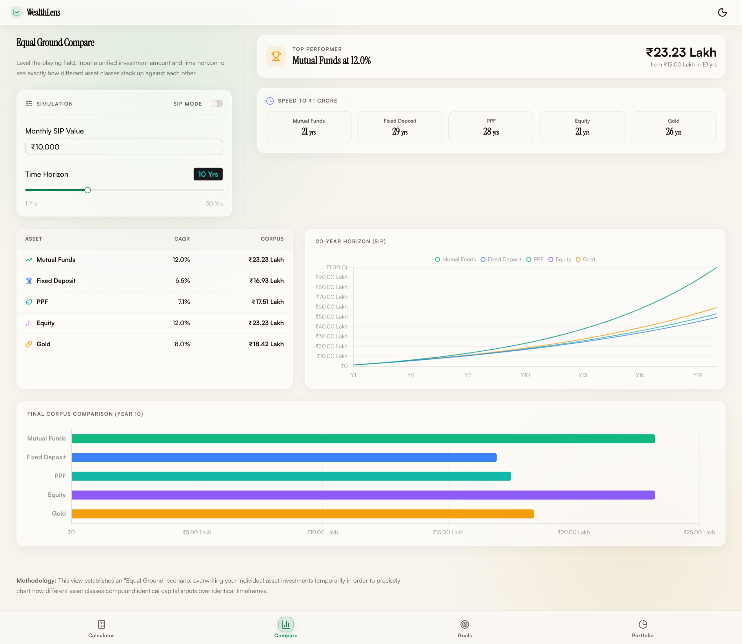
Figure 5. The compare view. Count the controls: one amount, one horizon, one SIP switch, top left — and then five assets that get no controls of their own at all. The scarcity is the feature.
A capture of the app running locally at ₹10,000 a month over ten years. Rates are the per-instrument assumptions the app ships with; the corpus figures are computed from them.
The compare view puts mutual funds, fixed deposits, PPF, direct equity and gold on one chart. The design decision is what the user can't do: there is no per-asset amount, no per-asset duration. One investment, one horizon, one SIP-or-lumpsum switch, five outcomes. Each asset keeps only its own rate assumptions: an FD gets its senior-citizen bump, a mutual fund loses its expense ratio, ETF gold loses its fee. Those genuinely differ per instrument, and flattening them would swap one dishonesty for another.
One inconsistency I'd fix before calling this shipped: the home-page calculator applies capital-gains tax to its results and the compare view doesn't, so the same inputs produce different corpus figures on two pages. Both numbers are defensible alone. Adjacent, they're a bug in the product's epistemology, not in the math.
Theming as a correctness problem
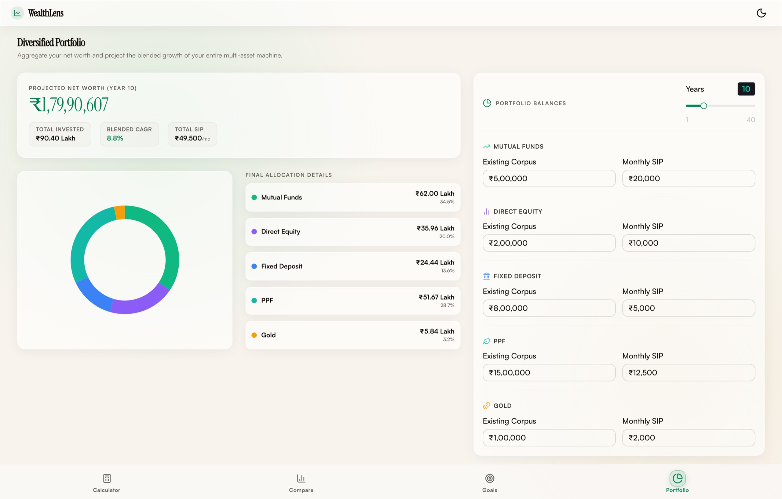
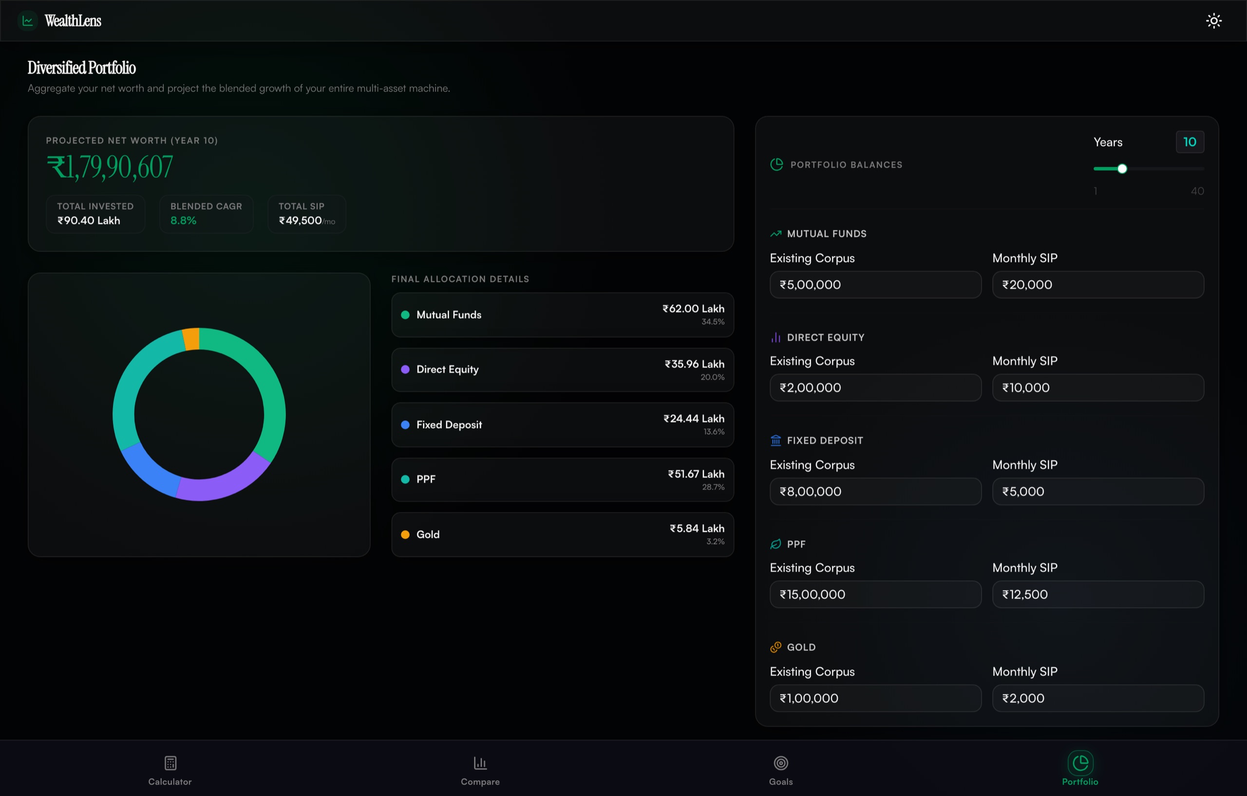
Figure 6. The same route on both grounds. The primary green is not the same green: it gains lightness and chroma against near-black so it reads as confident rather than murky, and the donut's five categories are each retuned to hold their separation on the darker ground.
Two captures of the same app at identical inputs, one per theme. The only difference between them is the resolved color scheme.
Every color in the stylesheet is OKLCH, and the dark theme is not the light theme inverted. The primary green keeps its hue and gains lightness and chroma when the ground goes dark, because the same green that reads as confident on warm ivory reads as murky on near-black. The gain, loss and neutral tokens (the three colors a finance UI lives or dies on) each get the same per-theme retune. That's the correctness argument: a theme isn't a palette swap, it's the same set of perceptual relationships re-established on a different ground.
The discipline holds right up to the chart boundary, and then it breaks. Chart.js can't read CSS custom properties, so both chart components branch on the resolved theme and carry hardcoded rgba values: a bright teal that ignores the token system entirely, and axis ticks at 40% alpha that are the one probable contrast failure in the app. The token system governs everything it can reach; the canvas is a foreign country with its own constitution. If I rebuilt this, the charts would be SVG for that reason alone — the reason this site's own charts are.
What I'd do differently
Wire the band before building the toggle. The lesson generalises: a control should not exist until the thing it controls does. Scaffolding UI ahead of behaviour feels like progress and manufactures exactly this class of silent lie.
One tax policy, stated once. Post-tax on one page and pre-tax on another is the kind of inconsistency no user will report and every user will be misled by. The fix is a single derived layer both pages read from, which is also what the store was for; the goal planner bypassing the store for local state is how the drift got in.
The store earned its keep only where it was used. Three of four routes keep local state, which made each page simpler and the app less coherent: settings set on one page silently don't follow you to the next. For a tool whose whole premise is carrying your assumptions across framings, that's the architecture contradicting the product.