Internal platform
An internal wiki that refuses to persuade
A read-optimized company wiki compiled to static pages, where the auth model's one limitation ended up designing the content pipeline.
- Node.js·Notion API·Cloudflare Pages·Pages Functions·Vanilla JS


The reader is in a hurry
You have a specific question (what an acronym stands for, what an endpoint returns, who declares an incident) and you have about thirty seconds of patience. The answer exists. It's in the company Notion, four clicks deep, behind a workspace search that ranks by recency and a page tree that reflects how documents were written rather than how they're looked up.

An internal wiki has exactly one job: get that person to that answer before their patience runs out. Everything else is decoration, and decoration that doesn't help, hurts.
The design brief for this one was a single sentence: the wiki is gated to company email, which means every reader is already trusted, which means the design does not need to perform credibility for outsiders. That sentence eliminates most of what makes corporate tools look the way they do. No hero sections, no persuasion, no brand experience. A page here should read like a well-organized index prepared by someone competent, and a stub is allowed to look like a stub — a privilege no public site has.
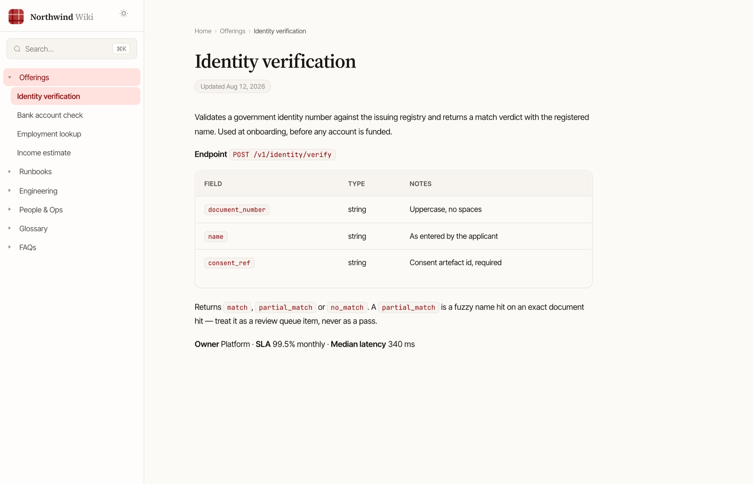
Figure 1. A page, at the top of the reader's thirty seconds: breadcrumb, title, an edited date, and then the answer. No hero, no card grid, no call to action — there is nobody here to convert.
The shipped build, run against a synthetic workspace. The real corpus is 122 pages of internal material and cannot be published, so the collector was swapped for a fictional company's twenty-seven; everything after the collector — transform, render, template, nav, breadcrumb, search index — is the build script unchanged.
- 122
- pages built per run
- 26 KB
- search index, entire corpus
- 504
- lines in the whole build script
- 3
- runtime dependencies
Why not just use Notion
We do, for writing. Notion is the editorial system: comments, drafts, simultaneous editing, all the things a static site is bad at. What Notion is bad at is being read in a hurry: heavy client, slow first paint, search tuned for the author rather than the reader.
So the wiki is a compiler. A build script walks the workspace from a root page, converts each page to markdown and then to HTML, rewrites internal Notion links to wiki URLs, downloads every image, and emits a directory of static pages plus one search index. Cloudflare Pages serves the result; a cron rebuilds it daily so the published surface trails the editorial one by at most a day. Writers keep their tool. Readers get sub-second pages.
Walk the workspace
Starting from one root page, recurse into every child page and database — including pages nested inside column layouts, which the API hides one level deeper and which cost a real bug to find. Three concurrent requests, because the API rate-limits and a wiki build has no reason to hurry.
{ id, title, url, parentId,
  children, depth, summary,
  status, lastEdited }
Markdown, with the escape hatches handled
Each block type gets a transformer; images and file attachments are downloaded and rewritten to local paths so the built site depends on nothing upstream. A page that references a page becomes a real relative link, resolved against the map from the collect pass.
Template, nav, breadcrumb, cards
Markdown to HTML, wrapped in the site shell: a nav tree derived from the page hierarchy, breadcrumbs, child-page cards for section landings, and a meta description cut from the first 155 characters of body text. One directory per page, an index.html in each.
dist/offerings/pan-verification/
  index.html
One JSON file for search
Title, URL, and the first 500 characters of stripped body text per page. The whole corpus comes to about 26 KB — small enough to fetch once on the first keystroke and search in memory forever after.
[{ "title": "PAN verification",
   "url": "/offerings/pan/",
   "body": "Validates a PAN…" }]
Pages, plus the auth wall
The dist folder ships to Cloudflare Pages. A functions directory deploys alongside it as the auth layer — every request passes through it before any page is served.
Figure 2. One page's trip through the build. Everything upstream of the render is source-specific; everything downstream doesn't care where the content came from.
The rejected references did the designing
The fastest way to specify this design was to name what it must not look like. Each rejection carries its reason, and the reasons, not the rejections, are the actual spec.
Too friendly to be fast
Notion's public sites read consumer: generous whitespace as decoration, soft illustration, a tone that's selling something. An internal reader isn't being sold to, and the whitespace they need is the kind that separates answers, not the kind that performs calm.
The institutional-CMS reflex
Heavy chrome, dated typography, the unmistakable feel of software chosen by procurement. The failure isn't ugliness — it's that the chrome outweighs the content, and the reader's thirty seconds get spent parsing the tool instead of the page.
This is documentation, not a status board
Dark navy with neon accents is a category reflex borrowed from observability tools. A wiki page is prose read in office light, and prose wants a light warm ground and ink that doesn't glow.
Beautiful, and built to persuade
The strongest rejection, because it's the flattering one. Stripe's docs are excellent external surfaces — designed to convince a developer to choose Stripe. An internal wiki has no one to convince. Borrowing that polish means importing persuasion machinery into a room where everyone's already inside.
Nothing survives a Tuesday-afternoon lookup
Gradient logos, animated counters, decorative emoji, parallax. The test each of these fails: does it help someone who opened the page to decode an acronym? Emphasis in this system is type scale, never ornament — bold above 600 doesn't exist on the site.
Figure 3. Five references, five refusals, and what each refusal bought.
The same discipline produced a short list of banned defaults: pure-grey neutrals and link-blue (the uncustomized-template tell), viewport-scaled hero type, shadow ramps, backdrop blur. The palette is warm cream and warm near-black in OKLCH, one restrained accent with a stated budget of under ten percent of any surface, and depth carried by borders and background shifts rather than shadows. Three typefaces, each load-bearing: a serif for landmarks, a tight sans for body and UI, a mono for identifiers.
Search that fits in one paragraph
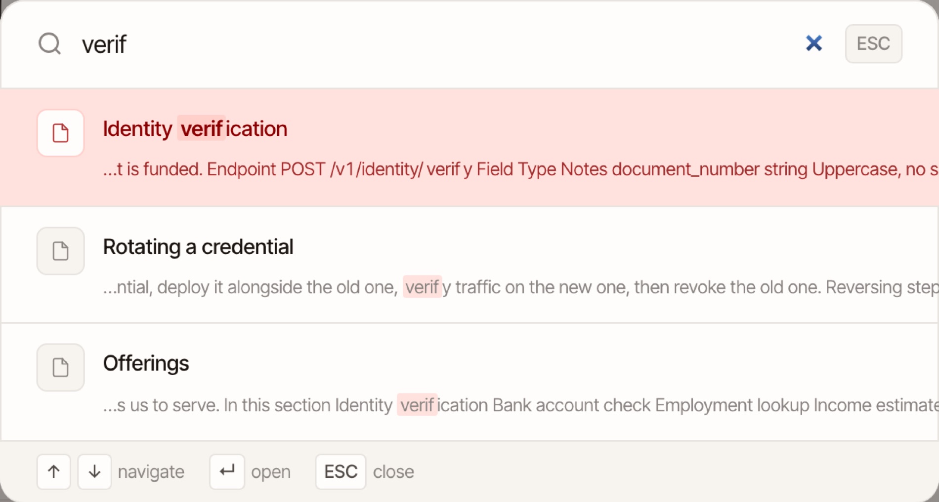
Figure 4. The palette, four keystrokes in. The exact-prefix title match wins the top slot; the two body matches below it are ranked by where in the body the hit lands. The whole index — every page in the corpus — was fetched once, on the first keystroke.
The shipped client, unchanged, against the synthetic corpus. One inconsistency the capture caught and I'm leaving in the sentence rather than the screenshot: the scrim behind this panel uses backdrop blur, which is on the design system's own banned-defaults list.
- PAN verificationtitle prefix · 784
- PAN-Aadhaar link statustitle prefix · 777
Figure 5. The production scoring ladder over a synthetic corpus. Watch the tier label — title beats prefix beats substring beats body.
Scoring, tie-breaks, the ten-result cap and the two-character floor are the shipped code, unchanged. The corpus is synthetic — the real index carries internal content.
There is no search server. The index is one JSON file, 26 KB for the whole corpus, fetched lazily the first time the palette opens, then scanned linearly per keystroke. The ranking is a four-tier ladder: exact title match wins outright, then title prefix, then title substring, then body substring. Two tiebreakers do quiet work: among prefix matches, the shorter title wins, and within any tier an earlier match position beats a later one.
No stemming, no fuzzy matching, no inverted index. At 122 pages, a linear scan over 26 KB completes faster than a keypress repeats, and every clever thing search could do is a way to return something the user didn't type. The honest upgrade path is indexing more — full body and headings instead of a 500-character prefix — not matching smarter.
The auth model designed the content pipeline
The access model is deliberately flat: a Google sign-in restricted to the company domain, a signed cookie, seven days. One tier. Any employee sees everything. The auth layer is three small serverless functions and cannot express "this page is for managers only" — and adding per-page tiers would mean a real authorization system, which is exactly the infrastructure this project exists to not have.
Figure 6. The pipeline, with the decision that shapes it marked. Because the serving layer can only answer yes or no to one question — is this a company address — the need-to-know decision has to happen at the far left, at crawl time. A page ruled out there never enters the pipeline, so it cannot surface in the nav, the cards, or the search index further down.
That limitation had to go somewhere, and it went upstream. If the serving layer can't do need-to-know, the build has to: sensitive pages are excluded from the crawl entirely, decided page by page in a sign-off document with three verdicts — include, exclude, or include-scrubbed. Excluded means never fetched. Not published-and-hidden, not access-controlled, not in the nav, and — the part that actually matters — not in the search index, which would otherwise leak 500 characters of every page it touched. A page the pipeline never saw cannot appear in any surface the pipeline builds.
That's the architecture story I didn't expect this project to have: a constraint in the smallest component, 278 lines of auth, dictated the design of the largest one. The alternative reading is that it's a workaround. Both are true. The difference between a workaround and a design is whether you wrote it down before someone found out, and this one is documented as a decision with its alternatives priced.
What I'd do differently
Retire the upstream dependency sooner. The Notion collector is roughly sixty percent of the build script: the rate limiter, the block transformers, the image downloader, all of it exists because the source is an API rather than files. The planned second version moves content into the repo, halves the script, and replaces the daily cron with "publishing is merging a PR." I'd also add the guardrail the current build lacks: assert a minimum page count and zero broken links before deploy, so a bad content edit can't quietly ship a gutted site.
Two pages titled "Untitled" made it to production. The build trusts upstream data quality, and upstream is a workspace edited by everyone. A build that fails loudly on an empty title would have cost ten minutes and caught both.
I still can't tell you how many people use it. The success test was that anyone can hit ⌘K and land on the right page in three keystrokes, and there is no instrumentation behind the auth wall to say whether that's true. For an internal tool the fix is one counter, searches per week, which is the difference between believing the wiki works and knowing it does.